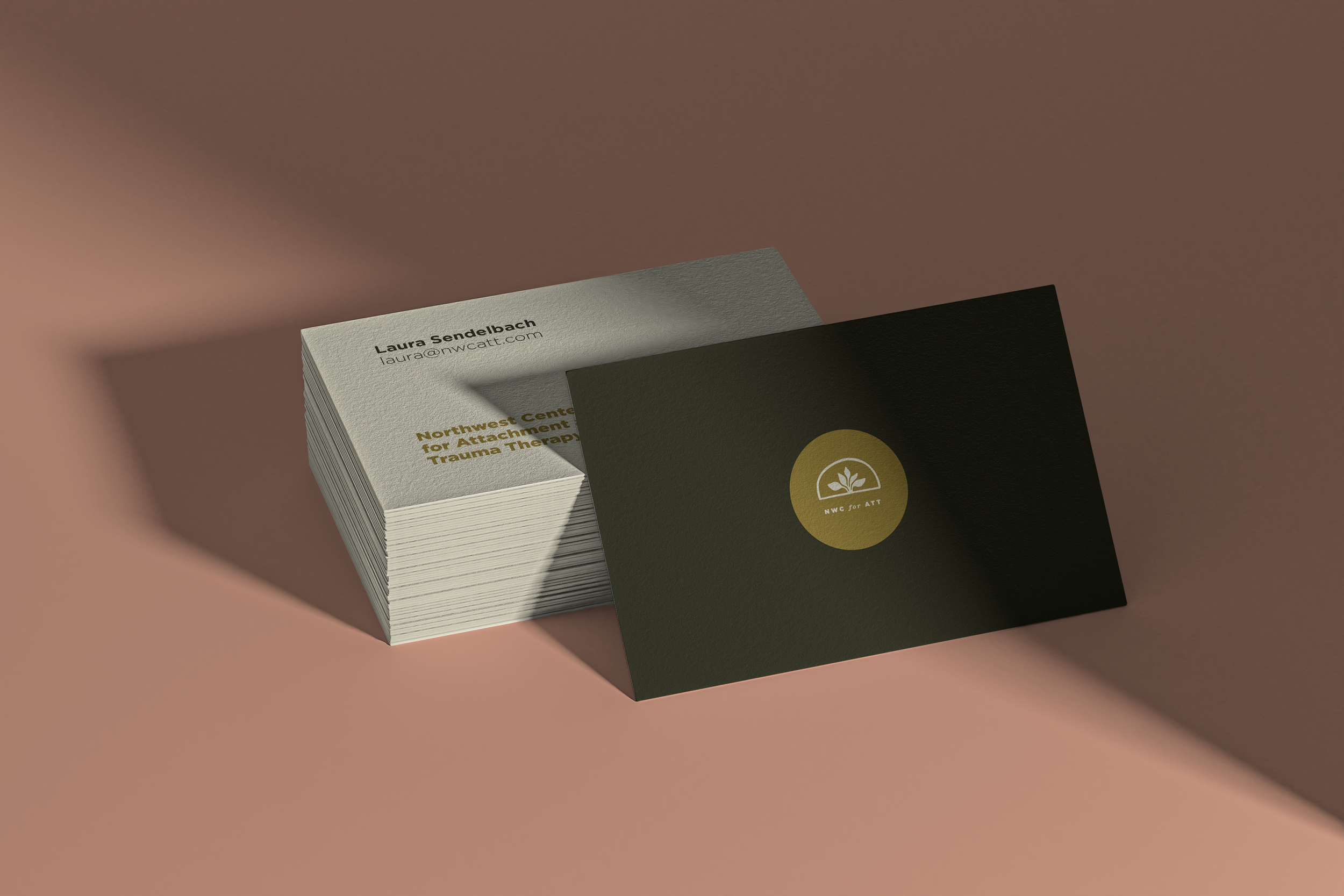

Northwest Center for Attachment and Trauma Therapy
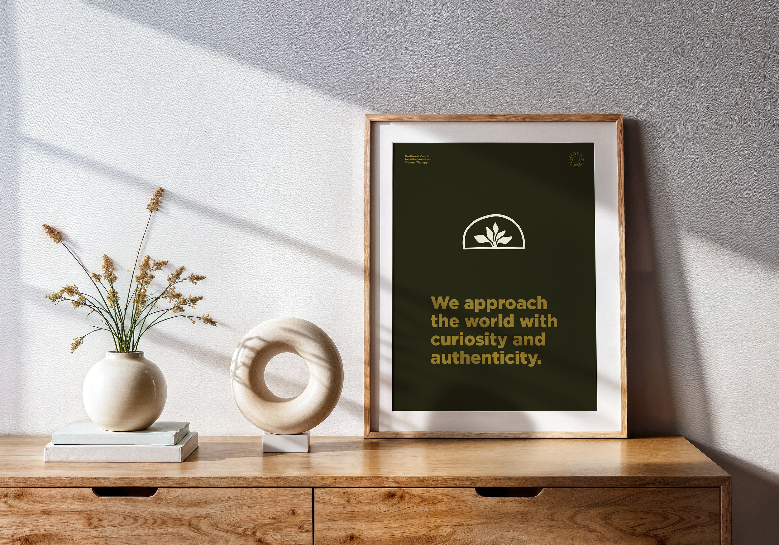
“We want the world to be a kinder place, and for everyone to have confidence in the possibility of goodness.”
The Process
Laura, the founder of NWCATT, knew the heart and soul of her business, but had never taken the time to put it into writing. I guided her through a series of thought exercises, helping her express her deeply impactful work and the way she thinks about the mission. We discussed her passion for helping people, the philosophy of her practice, and her focus on curiosity and optimism as guiding principles throughout her work. Over many conversations, we developed a language to convey both the Vocation and the Voice of her brand. Together, these would serve as a north star to guide the Visuals.
“A solid foundation to support healthy growth”
The Creative Direction
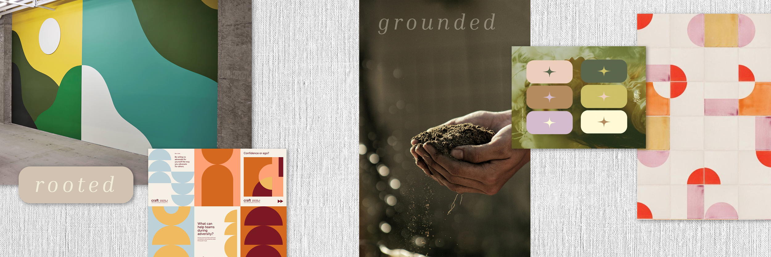
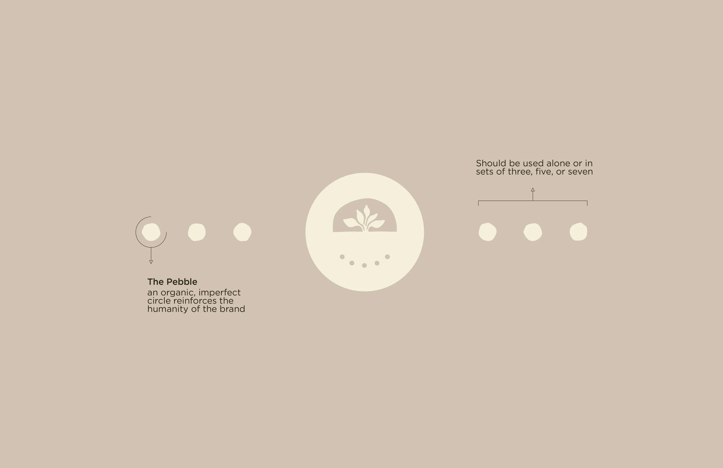
After sorting through inspiration imagery and moodboards, we determined that the visual direction that conveyed the established voice + tone of Laura’s brand was “Rooted.” A solid foundation to support healthy growth. Grounded and present; solid colors and balanced objects in minimal compositions. We aligned on an illustration style that was organic, handcrafted, and asymmetrical. A way to emphasize the imperfect but radiant human spirit.
The Logo
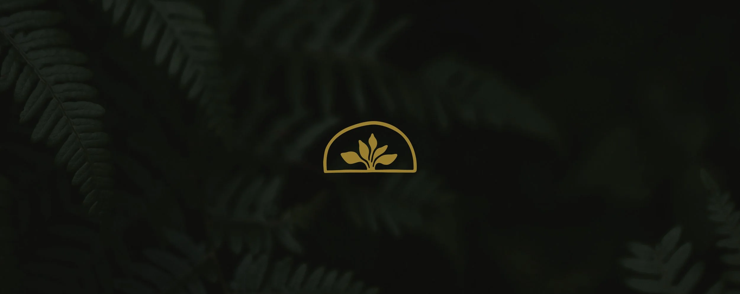
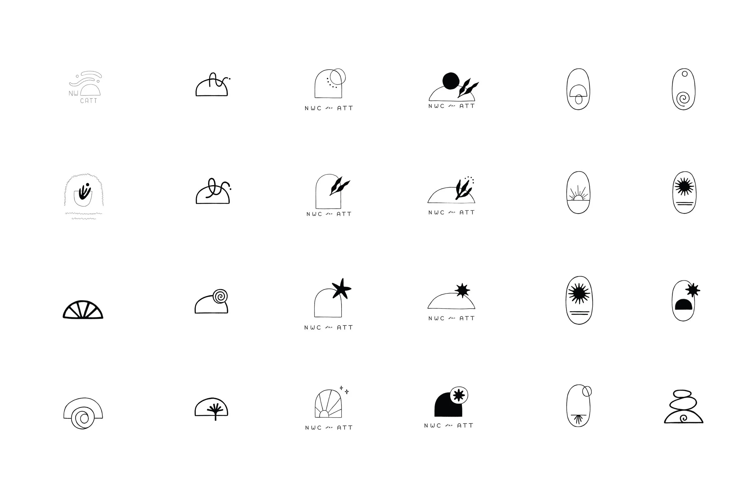
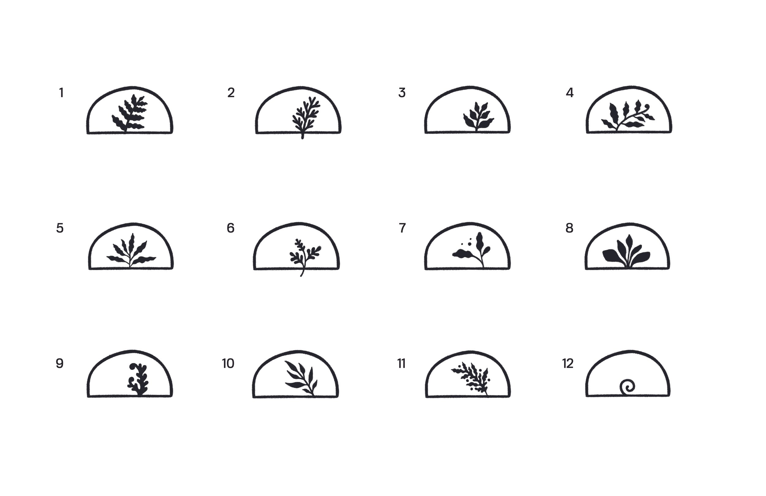
Symbolism played a large part in our early logo design explorations. The visual mark for NWCATT needed to embody Laura’s grounded yet optimistic approach. My sketches focused on the combination of a solid foundation and an upward trajectory, with a focus on resolved simplicity. Symbols included sunlight, stars, sprouts, and spirals, each of which communicated the central ideas behind Laura’s therapy philosophy.
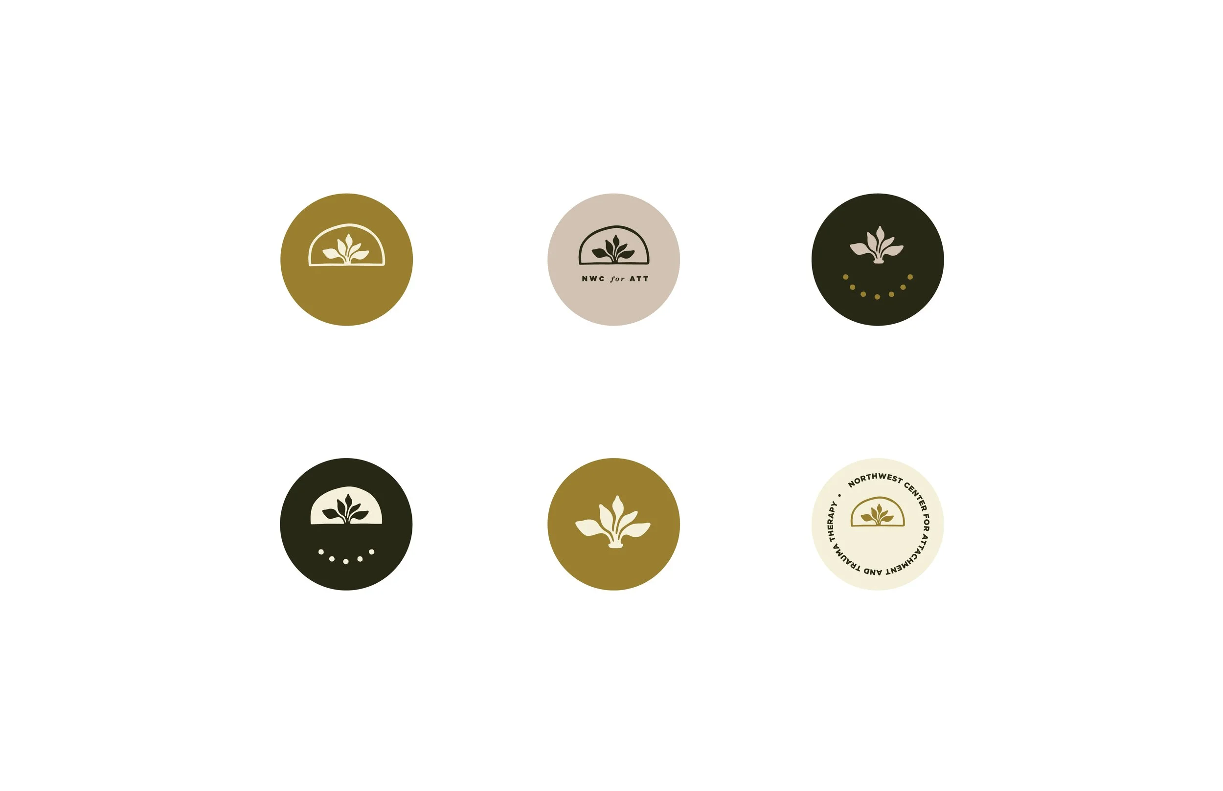
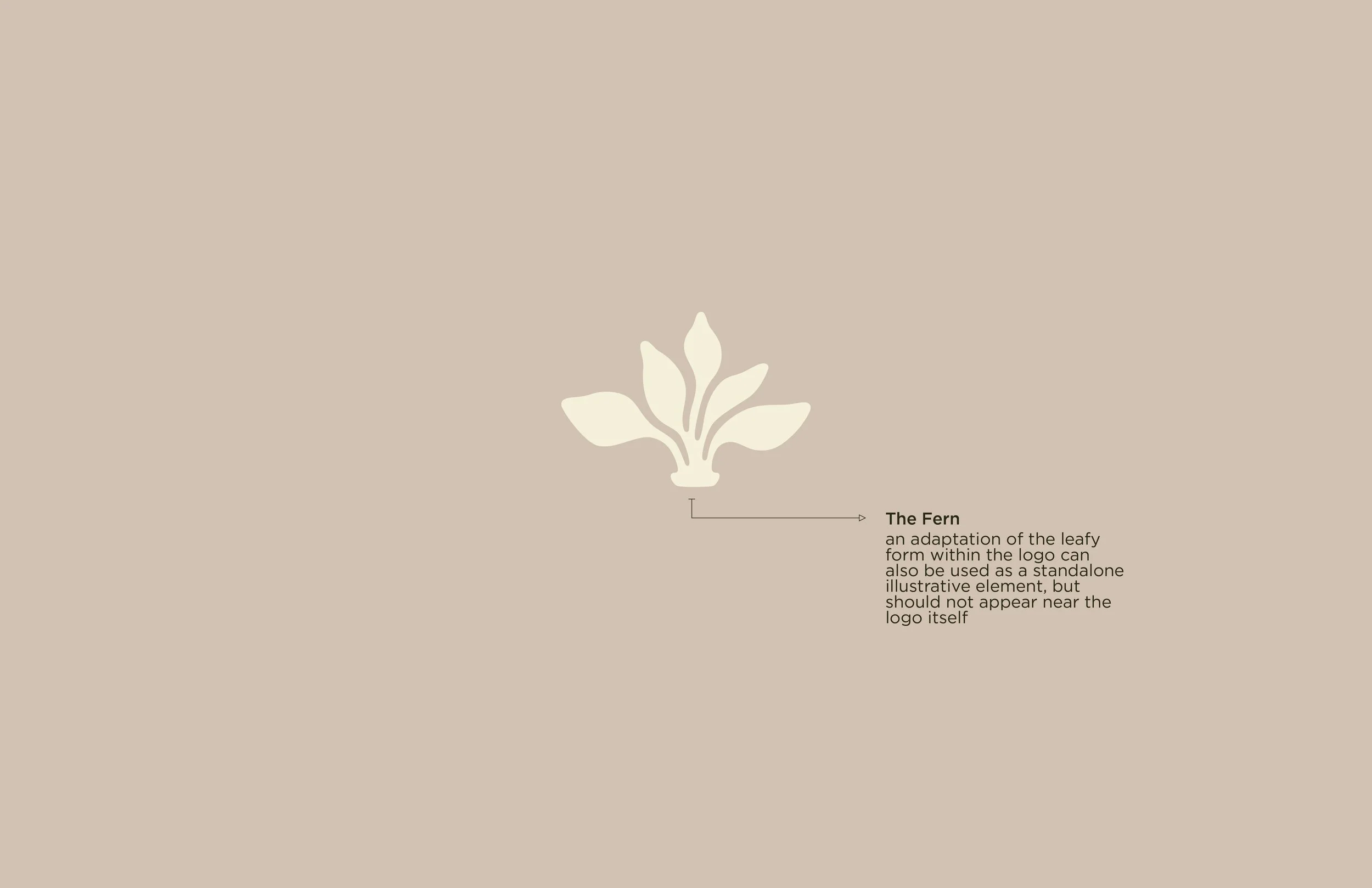
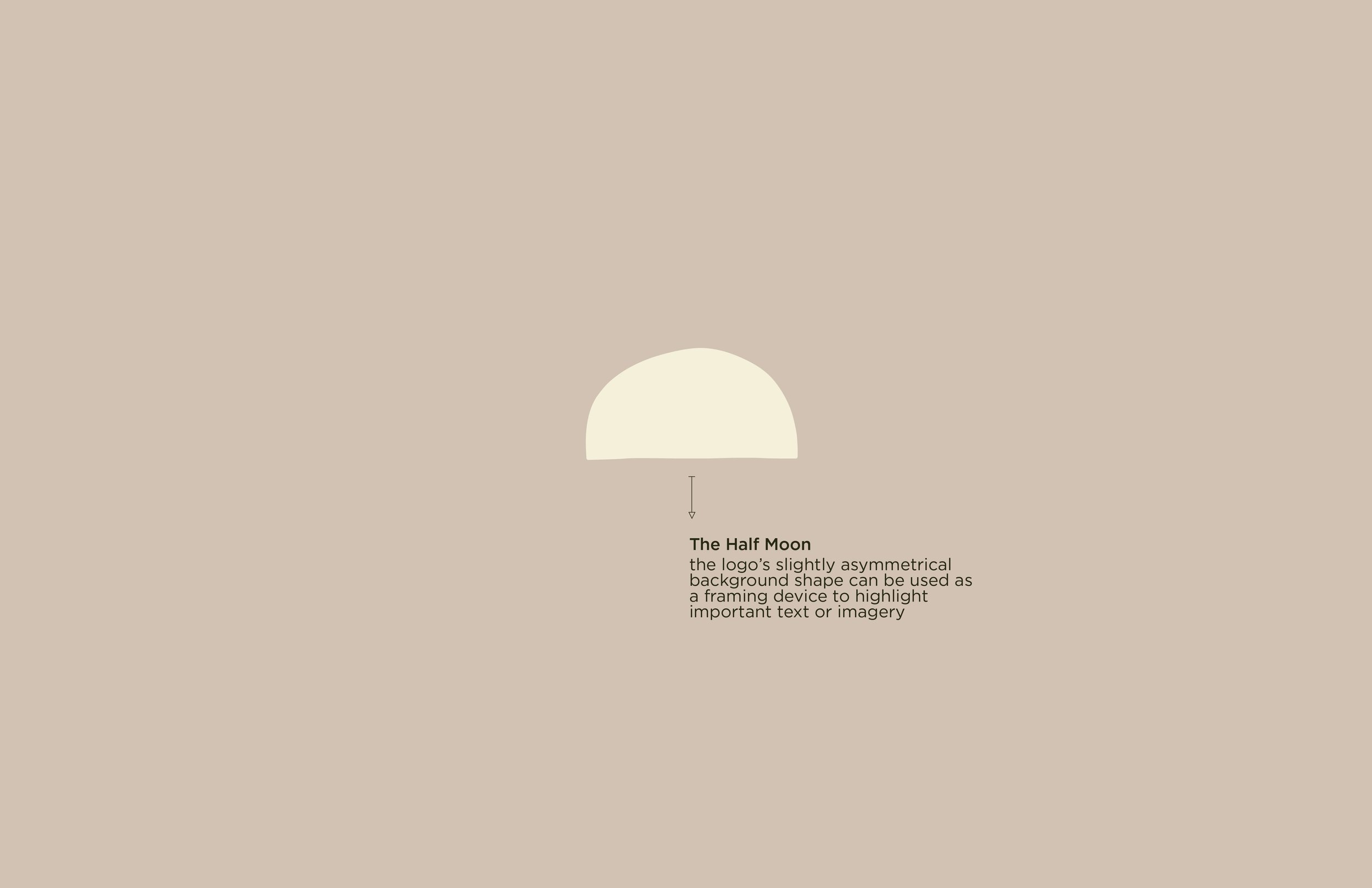
The final logo communicates both a grounded base and growth mindset. The shapes are slightly imperfect, giving a handcrafted feel, and the fern leaves suggest an expansive energy that lends multi-directional movement to the mark.
The Color Palette
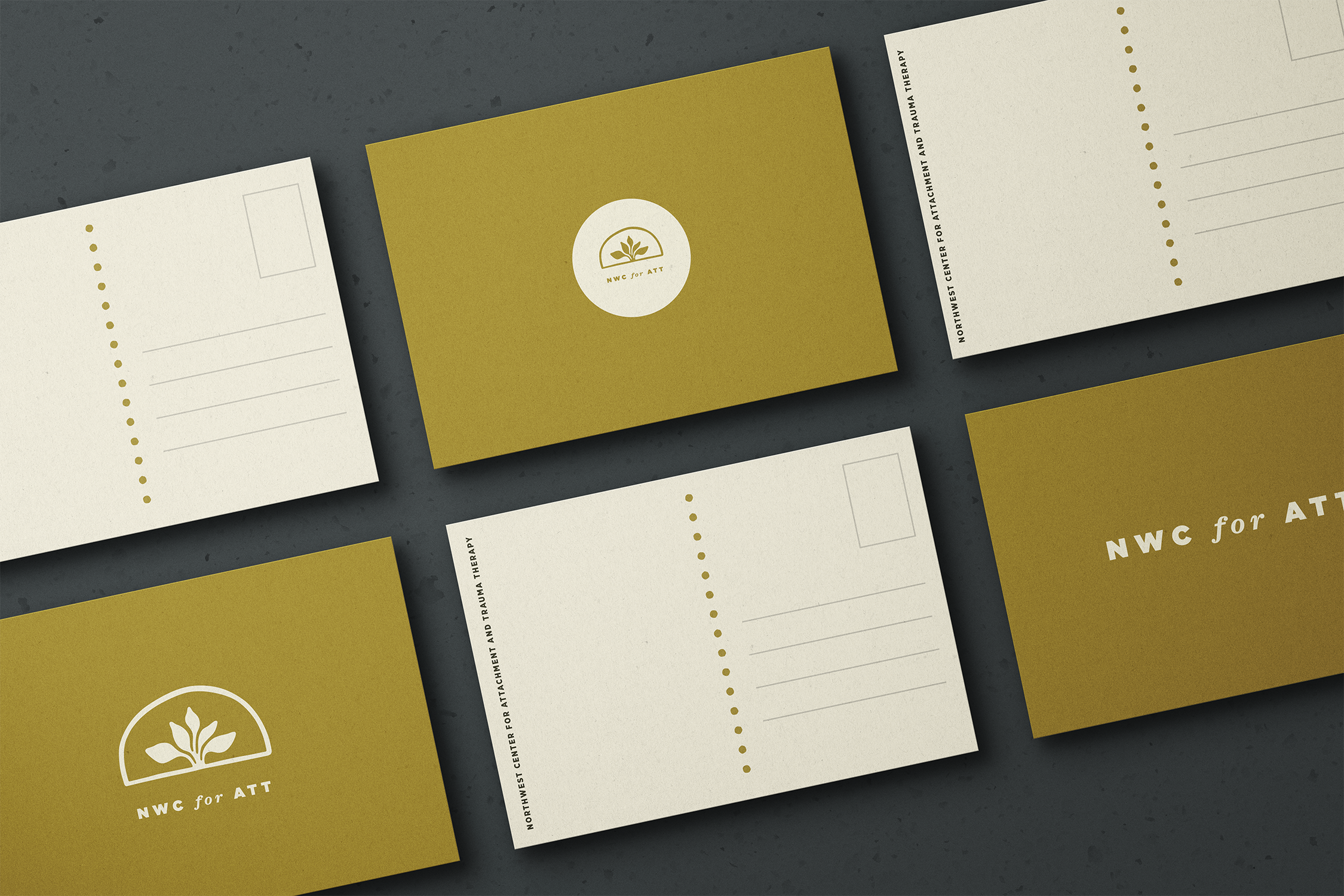
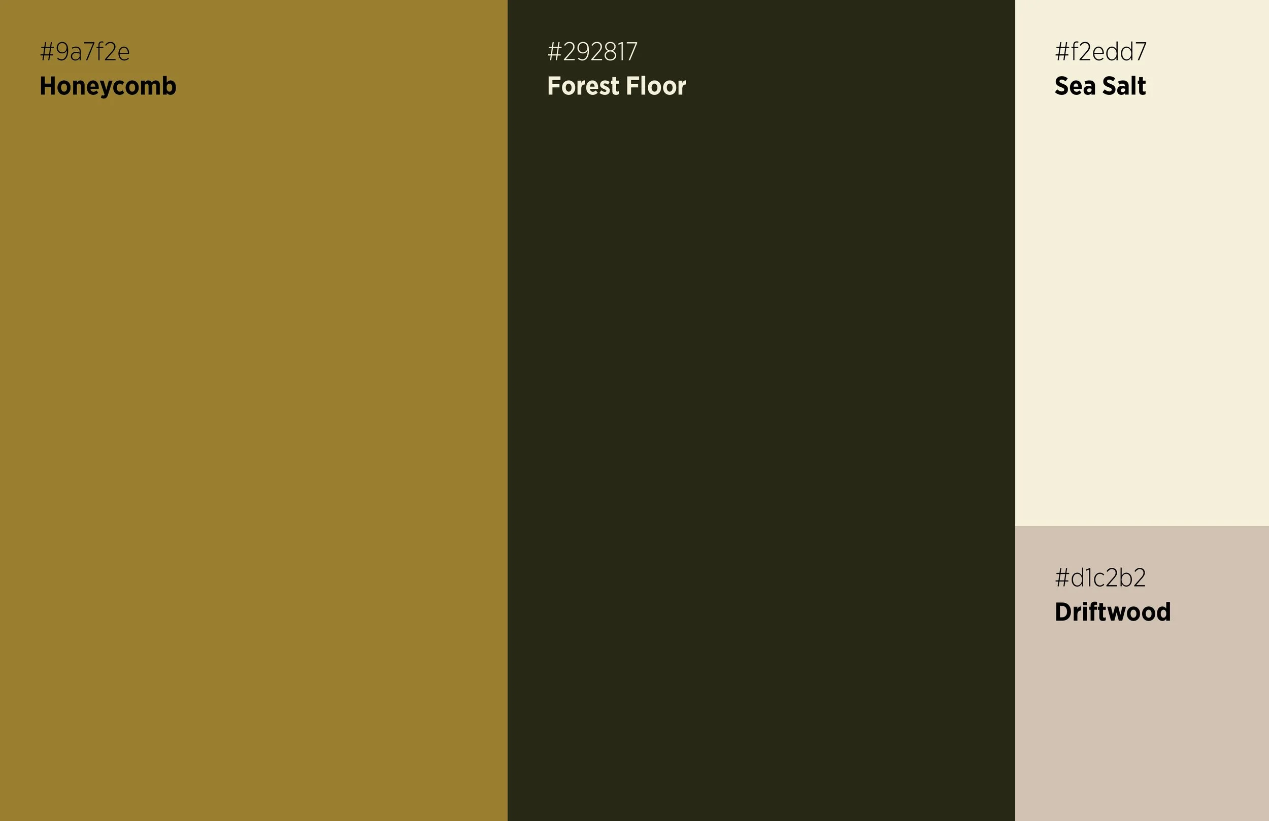
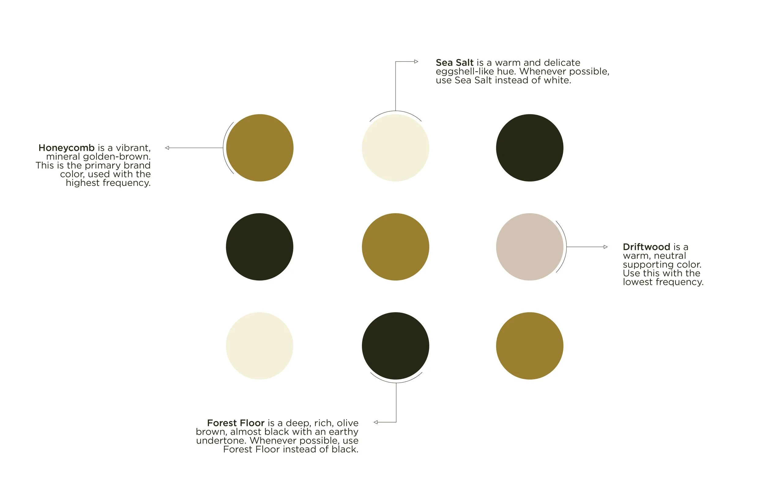
The brand colors evoke the forests of the Pacific Northwest without coming across too predictably green. The hues are nature-inspired, but not overused, and build a versatile color language for a bespoke and recognizable brand.
The Typography
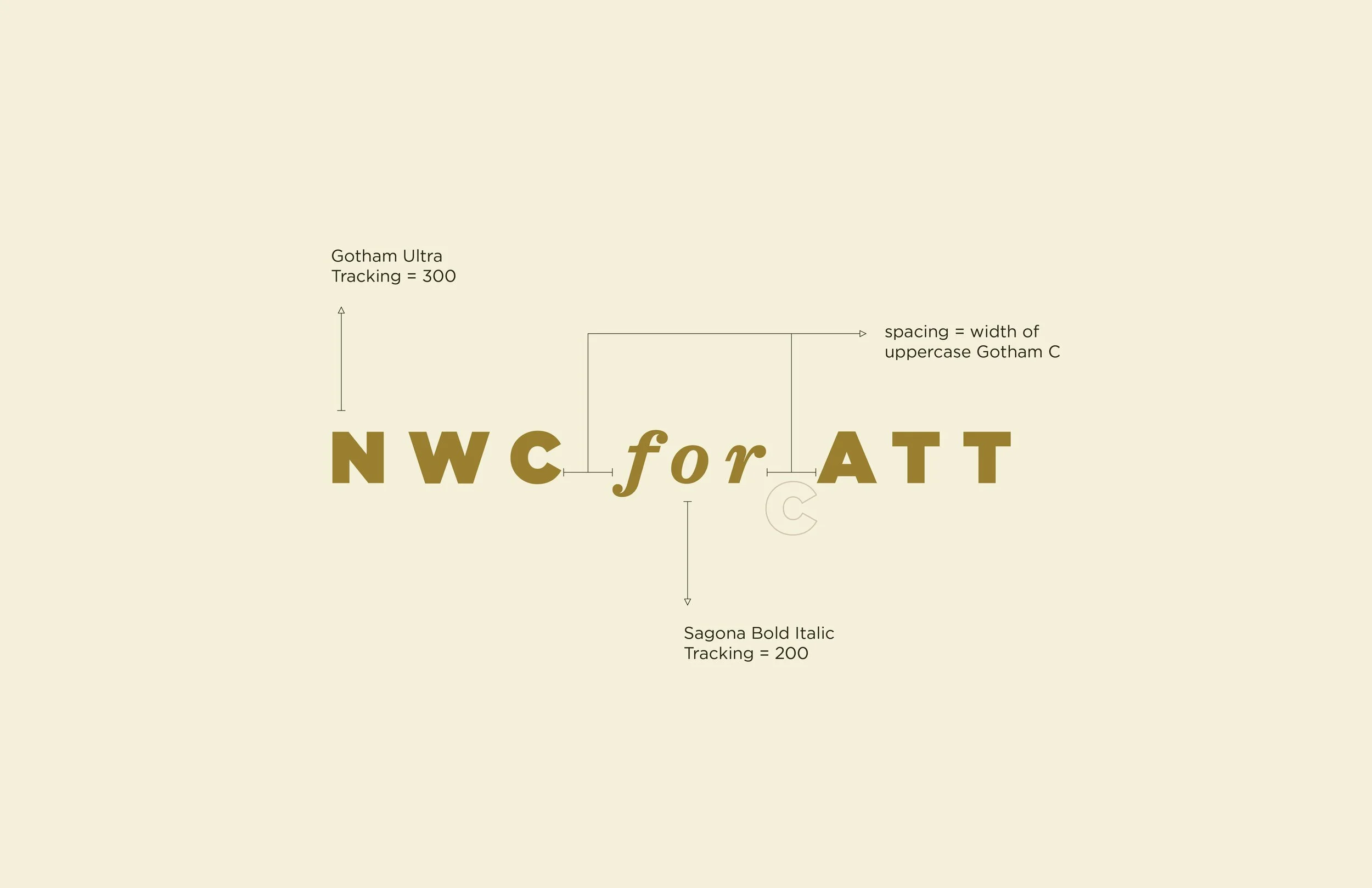
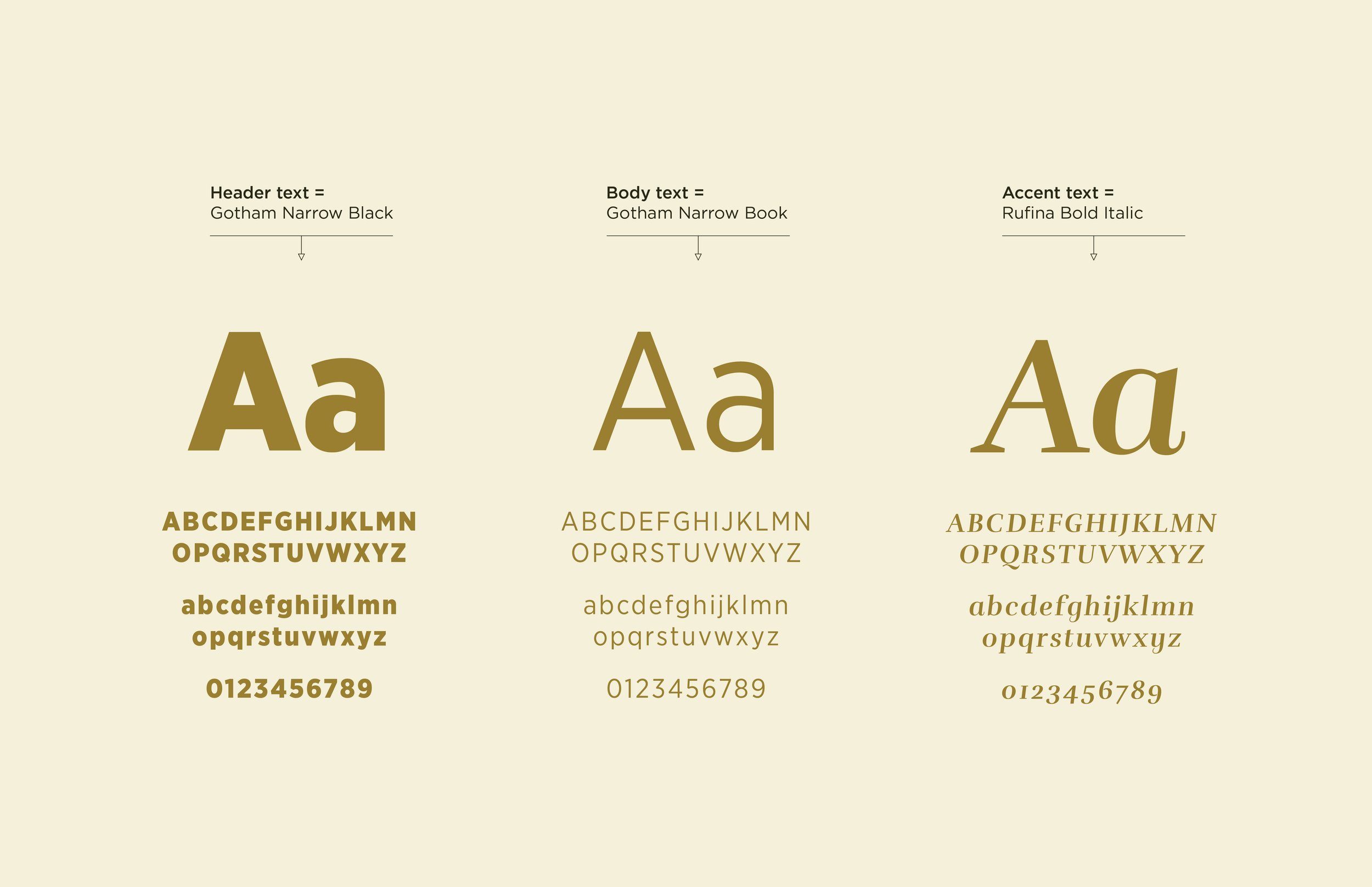
The NWCATT brand relies on the use of two typefaces. One, a geometric sans-serif, provides a grounded foundation and approachable legibility. The other, a quirky slab serif, shows the brand’s playful side by injecting moments of personality or humor.
The Brand
Laura wrapped up her branding process with a holistic visual system to differentiate her organization, and the language to communicate what sets her apart.